Fresh produce, fresher thinking.
50 years ago, Landau’s was the go-to. But times changed, and a new crop of stores opened their shutters to the masses. While Landau’s was known (and particularly legendary for their fresh fruits and vegetables) it was time for the supermarket to reclaim their status. And
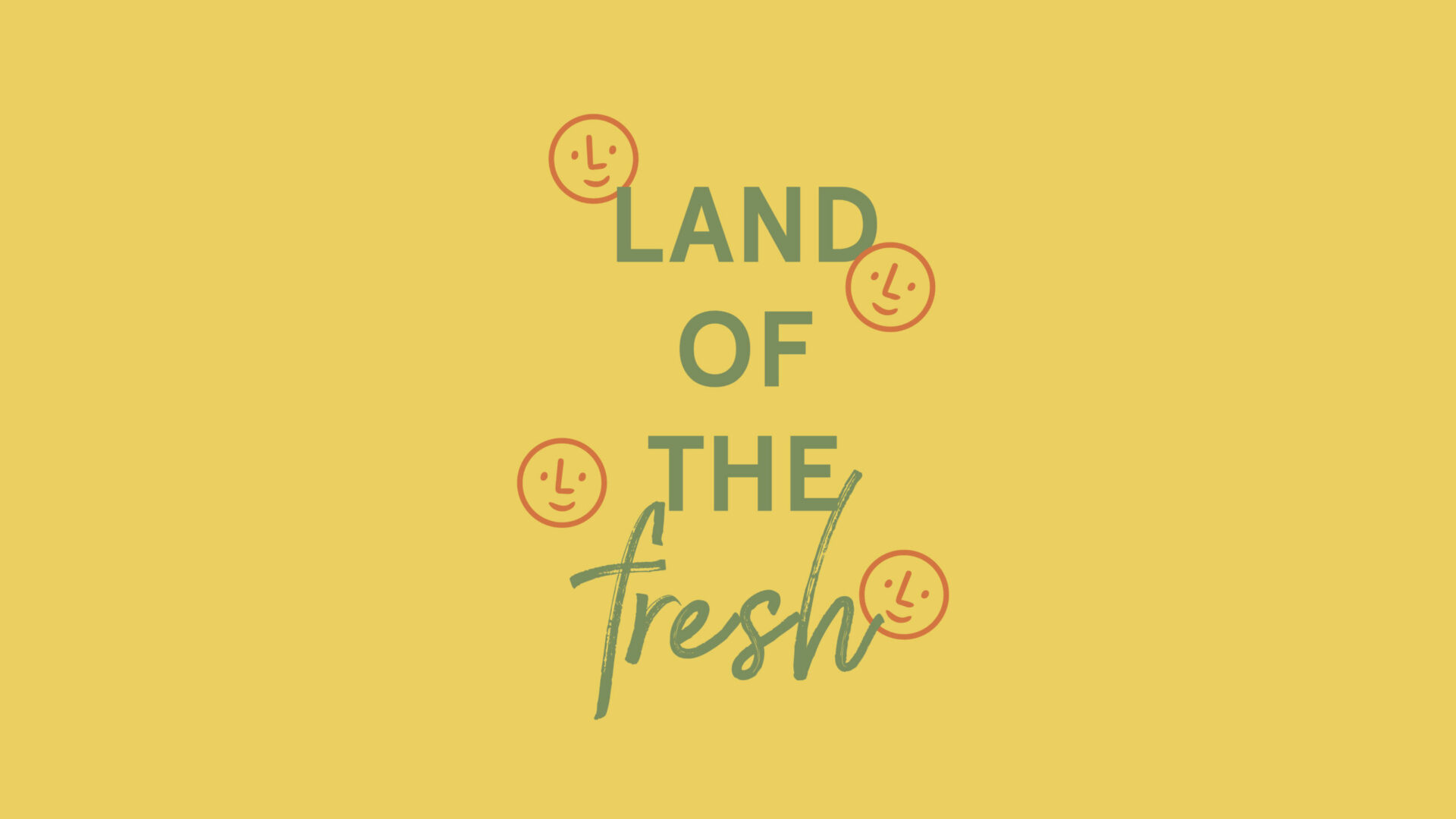
with the physical construction, a brand reconstruction was set in motion. Now, proudly stands a store up for public admiration, recognized for a distinct color, tone, and identity. Enter ‘Land of the Fresh’.
What we did
- Advertising
- Brand Identity
- Brand Positioning
- Brand Strategy
- Campaigns
- Digital Marketing
- Email Marketing
- Media Buying
- Naming
- Outdoor Media
- Packaging
- Photography
- Print Collateral
- Printing
- Research
- Signage & Environmental
- Social Media
- UX/UI
- Video & Motion
- Websites

-
The Turning Point
Good things in-store.
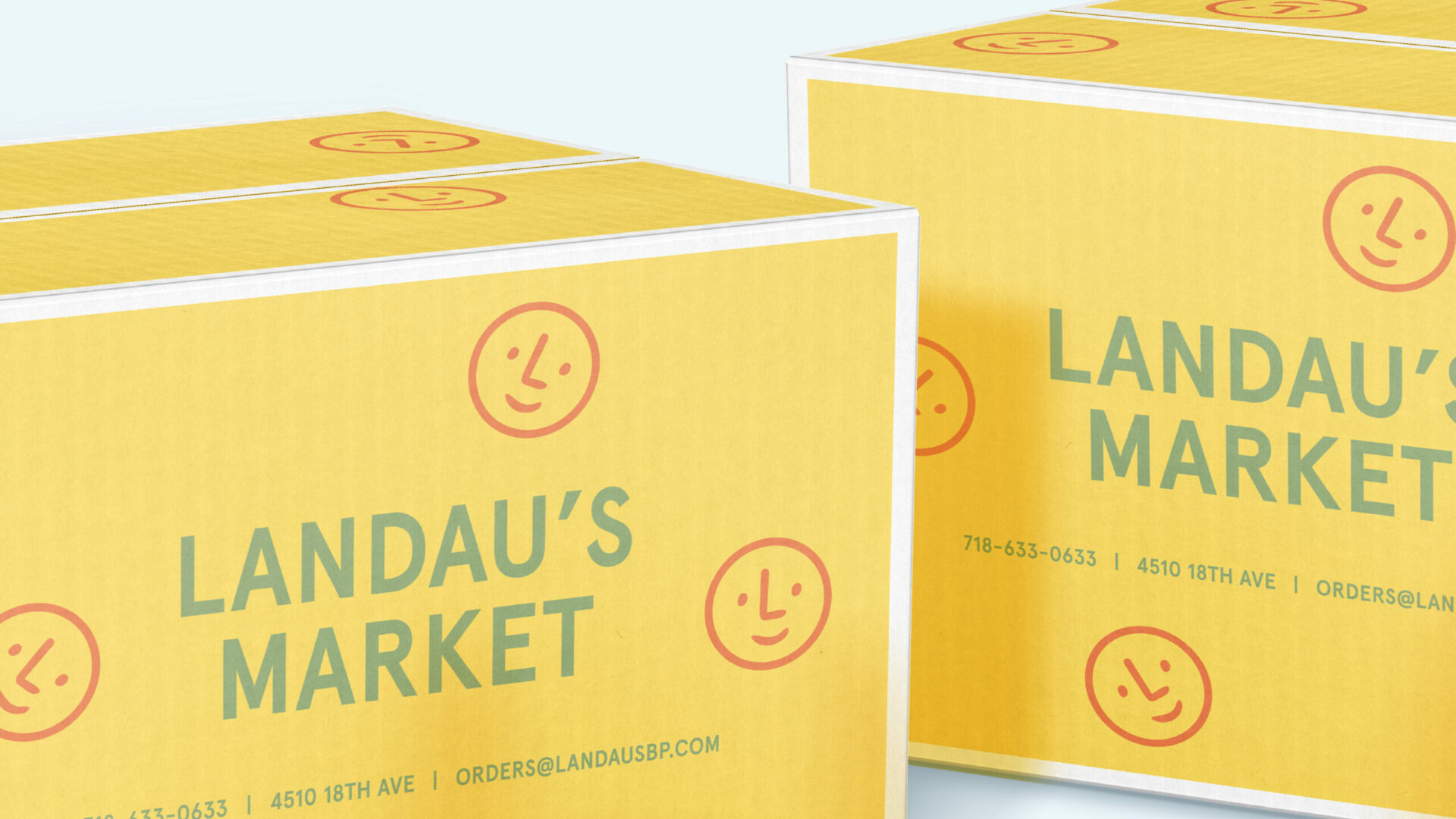
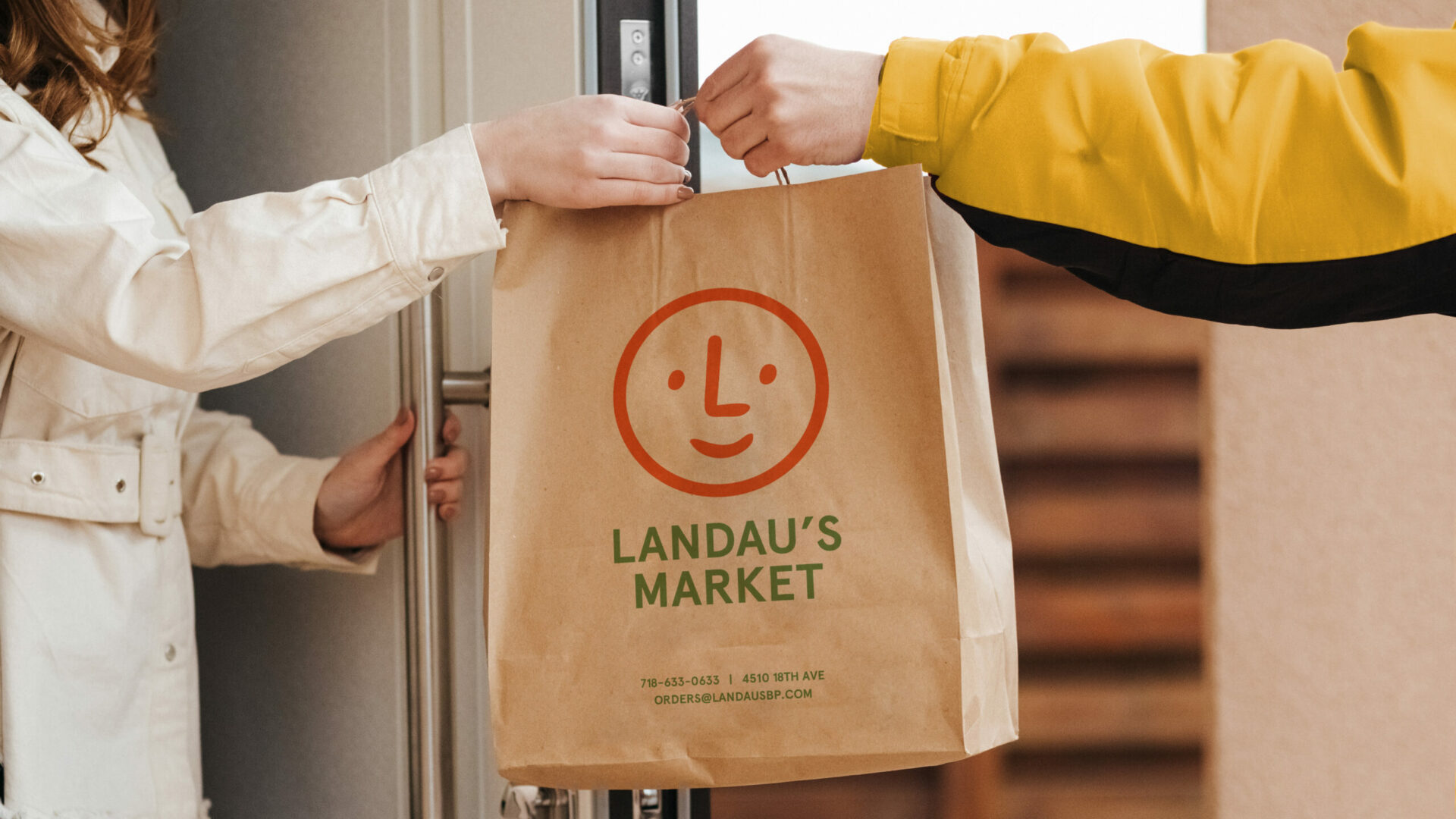
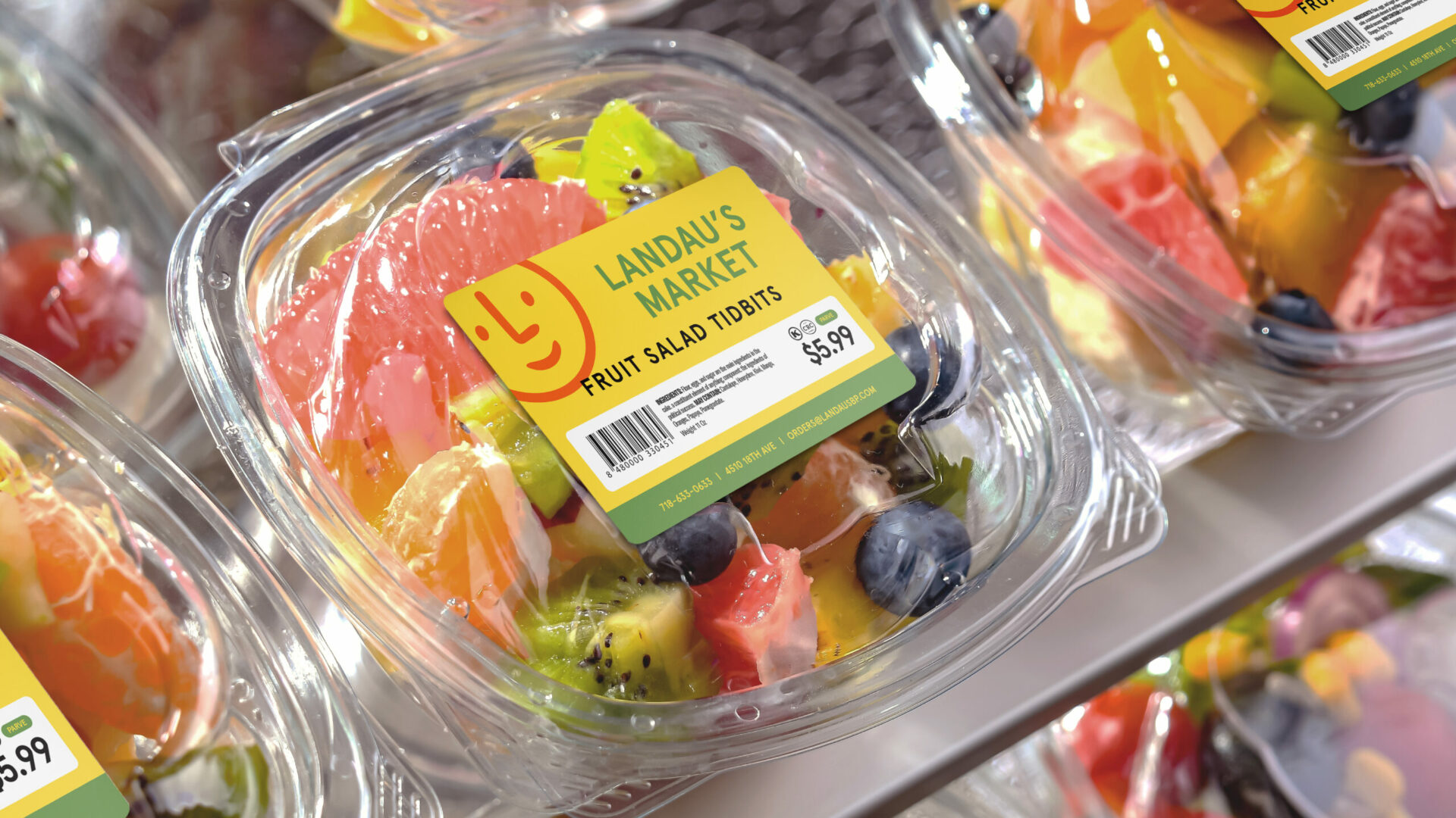
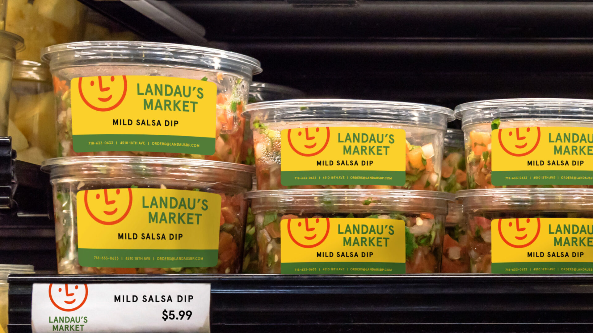
First came strategy. What do we want to achieve with this brand transformation? What is the goal, and what definite avenues will we need to take to get there? Through particularly deep research—scoping out the competitive landscape, GCNY transformed Landau’s color scheme, playing with bright hues, and creating a unique visual identity that stands out on the Brooklyn streets. A slightly whimsical, cheerfully worded messaging system developed simultaneously: highlighting the freshness of Landau’s and their store refresh.
-
The GCNY Partnership
Welcome to ‘Land of the Fresh’.
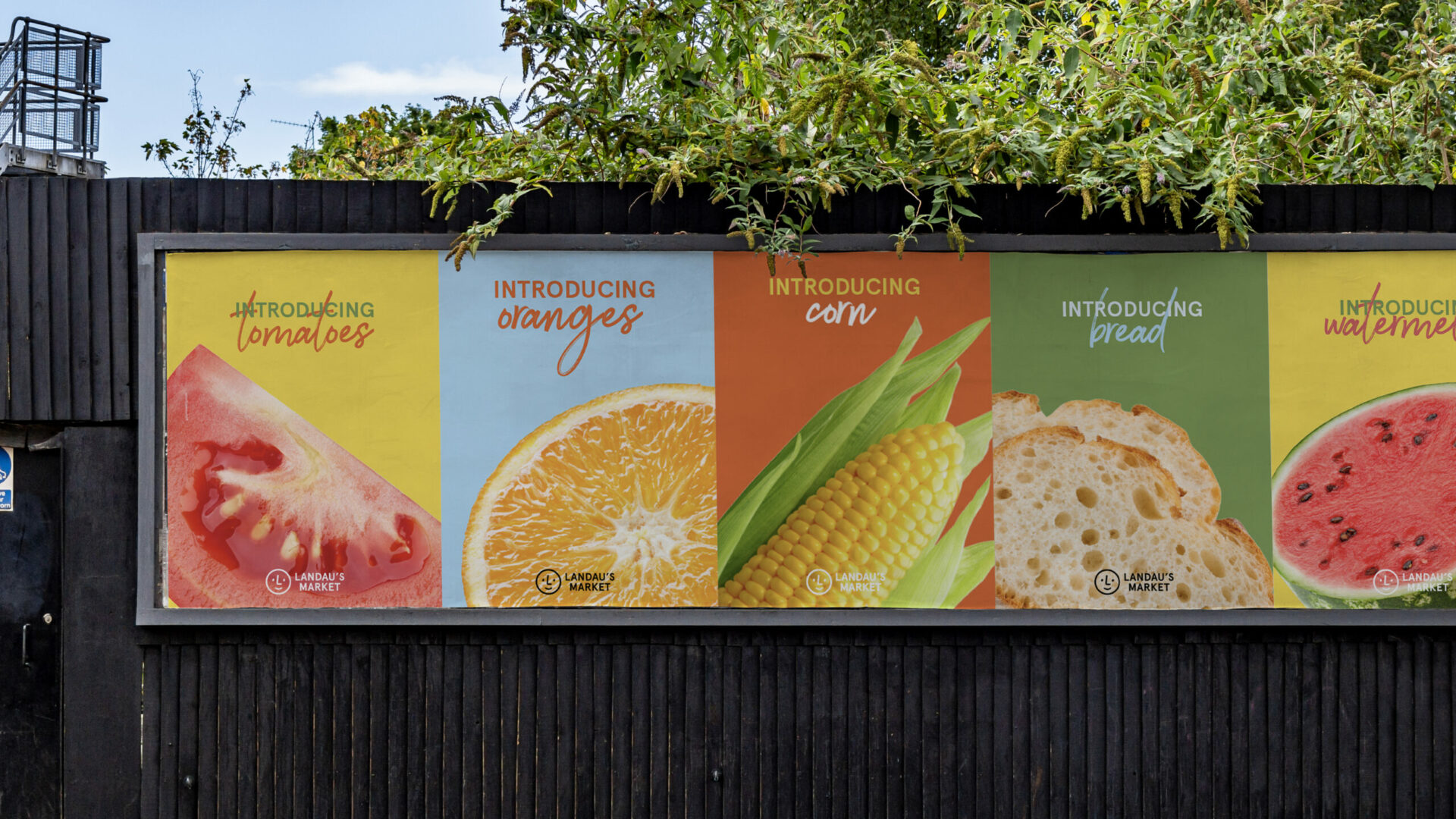
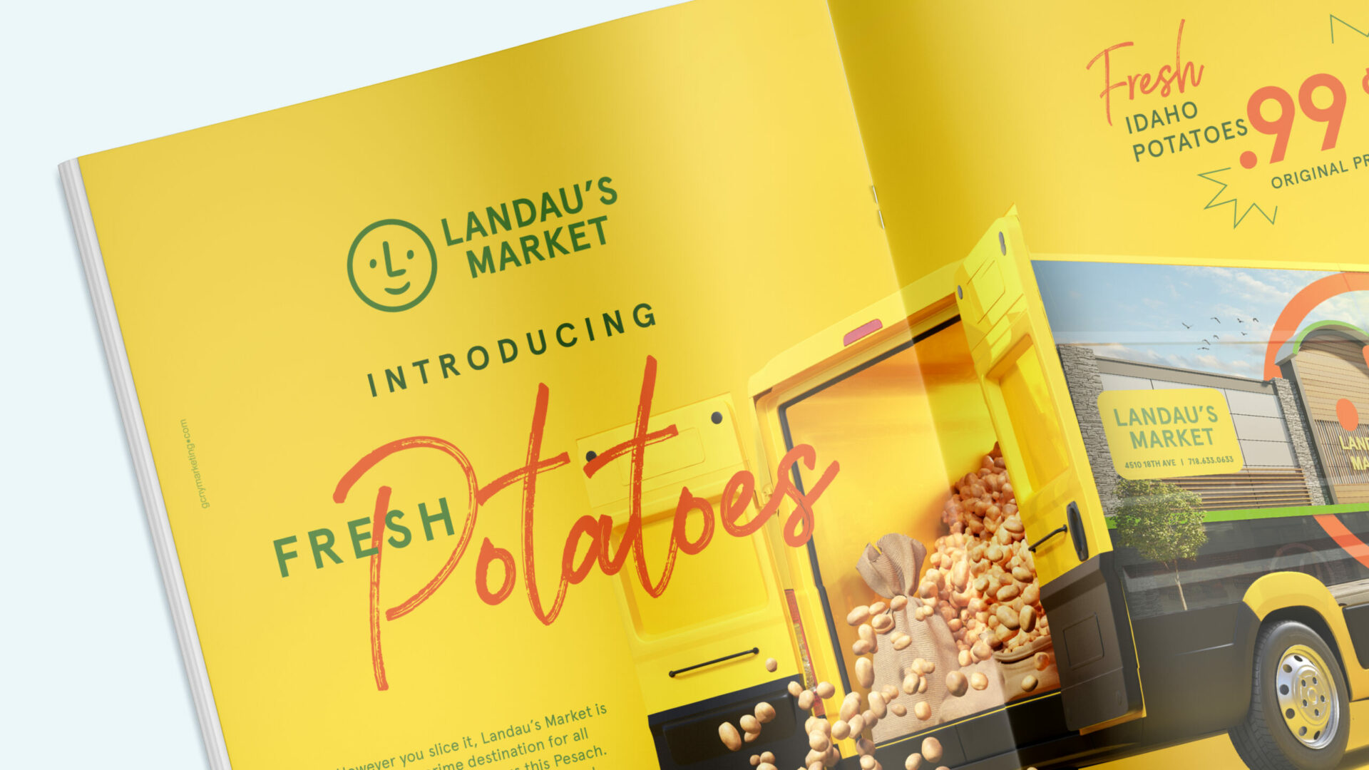
It started off with intrigue: ads placed all around Boro Park with cryptic messaging and distinctive branding. Curiosity was the name of the game, and it succeeded spectacularly, with a final reveal of Landau's new store. Signage, van wraps, magazine splashes, events that would draw attention to Landau’s beautiful grounds… Landau’s is known for freshness, and continues to reap the benefits of it.



-
Fresh produce, fresher thinking.
50 years ago, Landau’s was the go-to. But times changed, and a new crop of stores opened their shutters to the masses. While Landau’s was known (and particularly legendary for their fresh fruits and vegetables) it was time for the supermarket to reclaim their status. And with the physical construction, a brand reconstruction was set in motion. Now, proudly stands a store up for public admiration, recognized for a distinct color, tone, and identity. Enter ‘Land of the Fresh’.


-
The Turning Point
Good things in-store.
First came strategy. What do we want to achieve with this brand transformation? What is the goal, and what definite avenues will we need to take to get there? Through particularly deep research—scoping out the competitive landscape, GCNY transformed Landau’s color scheme, playing with bright hues, and creating a unique visual identity that stands out on the Brooklyn streets. A slightly whimsical, cheerfully worded messaging system developed simultaneously: highlighting the freshness of Landau’s and their store refresh.
-
The GCNY Partnership
Welcome to ‘Land of the Fresh’.
It started off with intrigue: ads placed all around Boro Park with cryptic messaging and distinctive branding. Curiosity was the name of the game, and it succeeded spectacularly, with a final reveal of Landau's new store. Signage, van wraps, magazine splashes, events that would draw attention to Landau’s beautiful grounds… Landau’s is known for freshness, and continues to reap the benefits of it.
